07/11/2014
Two recent decisions on comparison of very simple marks to assess the likelihood of confusion had very different outcomes and lead to a disappointing conclusion.
The two decisions have a good deal in common – both arose from opposition proceedings in the Community office (OHIM), both, unusually, concerned marks registered and applied for in respect of exactly the same goods (so there was no need to explore the complex interrelationship between similarity of goods and similarity of marks) and both related to everyday consumer products, so the relevant consumer was deemed to be reasonably well informed and reasonably observant and circumspect, and nothing turned on any specialist knowledge the consumer might bring to the party. Both decisions were determined entirely by the similarity of the marks under consideration.
The first decision (Kania OHG v France Kebab – Opposition No B 2278276) is a model of clarity and reasonableness. The marks under consideration are shown below:
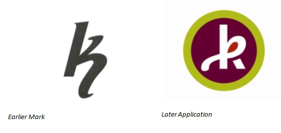
The Opposition Division of OHIM found these not to be similar because:
- the signs are aurally and conceptually identical but, they are visually dissimilar – even if both share the letter ‘k’, it is stylized in different ways in each sign; therefore, the graphical characterisation of both signs is completely different.
- the earlier mark consists of a stylised letter ‘k’ with an extended lower line whereas the contested sign is composed of a highly stylised letter ‘k’ represented over two concentric circles in green and purple; the stylisation of the contested letter ‘k’ consists of a loop at the top filled with orange that continues behind the letter’s vertical line
- the colours used on the contested sign help to differentiate the signs, being bright colours (orange, purple and light green)
- the shorter a sign, the more easily the public is able to perceive all of its single elements – therefore, in short words small differences may frequently lead to a different overall impression (in contrast, the public is less aware of differences between long signs)
- considering this, the way the letter appears in each sign is determinant
In reading this decision it has to be remembered, of course, that neither party is seeking to establish rights in the letter k; each is claiming rights only in its own particular representation of the letter. In this light, the Opposition Division’s decision is entirely sensible.
Unfortunately, this decision is arguably countered by another from a higher tribunal, the General Court of the European Community in T 342/12 of 8 October 2014.
The marks under consideration in this second case are shown below:
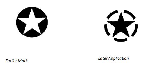
Of course, stars are not letters but, again, neither party was in a position to claim rights in five-pointed stars per se and, by way of background, there are so many marks registered for the relevant goods (clothing) which incorporate a single star that it’s impossible to discover how many there actually are using the standard trade mark search engines (because they are set to display only the first hundred or the first thousand entries found and the results here go beyond those figures). Further, of course, in the clothing business, stars may be used as purely decorative motifs and so are generally considered to be low on the scale of distinctiveness necessary for a trade mark to distinguish the goods of one business from those of another. So, stars are not letters but they have quite a lot of features in common with letters and one might have hoped for a similar approach to that taken in relation to the ‘k’ marks discussed above.
The General Court found these two very simple marks to be similar enough to cause confusion, even against the commercial background outlined above, saying:
- the signs at issue consisted of the figurative representation of a five-pointed star, shaped identically, placed within a circle, the proportions between the size of the star and the size of the circle being identical ( I’m not sure this is true; it may be an optical illusion but in the later mark the points of the star appear to me to extend beyond the ‘circle’)
- the differences between the two signs are the colour of the star, which is white in the earlier marks and black in the mark applied for, the fact that the background to the circle is shaded black in the earlier marks
- the circle of the mark applied for is outlined in an intermittent black line, and not a continuous line and the fact that the circle in the mark applied for is represented by a dashed line cannot suffice to find that it is not a circle.
I find this analysis disappointing but, to be fair, no evidence or detailed argument seems to have been presented as to how the later mark is perceived by the consumer. To me, the fact that the broken line is quite heavily drawn and the same tone as the central star means that I do not see the implied circle lying behind these features very strongly but, rather, see the later mark as a star superimposed on a broken ring. At the very least, there are grounds to argue that the later mark consists of three elements, the star, the central ‘circle’ and the outer, broken ring not present at all in the earlier mark.
Most reasonably informed, observant and circumspect consumers, could, in a field full of stars, separate these two marks quite easily, I suspect.
This article is for general information only. Its content is not a statement of the law on any subject and does not constitute advice. Please contact Reddie & Grose LLP for advice before taking any action in reliance on it.